You spot the drop first. Maybe it is a cliff at the fifteen second mark, maybe a slow bleed across the whole video. The retention graph is telling you where viewers stopped watching. It is not telling you why, and the mistake that wastes the most time is treating every downward line the same way regardless of where it sits.
This article gives you a way to read the shape and the location together, so a drop at the hook gets a different diagnosis than the same drop at a chapter break. It will not tell you the one cause of your specific drop — nothing can do that from the graph alone.
What the retention graph is actually plotting
The line is the percentage of viewers still watching at each second of the video, plotted against the video's timeline. A point at 30% around the two-minute mark means three in ten of the people who started the video were still watching at that second.
Two things distort a first read. Spikes upward are usually replays — a section people rewatched, often a moment referenced elsewhere in the video or a clip that got shared out of context. Read a spike as re-engagement, not as new viewers joining partway through; almost nobody does that. And the whole curve trends down by nature, because every video loses some viewers continuously. A gentle downward slope is the default shape, not a symptom on its own.
Reading shape: decline, cliff, spike and plateau
Four shapes recur and each describes a different pattern of viewer behaviour before you assign any cause.
A gradual decline is a steady, roughly linear loss of viewers with no sharp step anywhere. This is the default shape of nearly every video and by itself is not a red flag.
A cliff is a sharp vertical drop concentrated in a few seconds. This means a specific moment caused a batch of viewers to leave at once, as opposed to a slow trickle.
A spike is a short upward jump, usually followed by the line resuming its prior slope. Treat this as replay behaviour on a specific clip, not new audience.
A plateau is a flattening where the decline nearly stops for a stretch. This means whoever remained at that point is engaged and staying, which is useful information about who your video retains once the early filtering is done.
None of these four shapes tell you the cause by themselves. They tell you the pattern. The cause depends on where the shape sits.
Why location on the timeline changes the diagnosis
The same size drop means something different depending on when it happens, and this is the part most retention explainers skip.
A cliff in the first 30 seconds is usually a promise-delivery mismatch: the title or thumbnail set an expectation and the opening did not confirm it fast enough. This is a packaging-to-content handoff problem, and it is the most fixable of the three because the fix is entirely in your control on the next video.
A cliff at a chapter boundary or an obvious topic change is often just normal skimming. Some viewers came for one part of the video and leave once they get it. A drop here is not automatically a failure — it can mean the chapter did its job for viewers who only wanted that section.
A slow decline spread across the whole runtime, rather than concentrated at one point, is usually a pacing problem, not a hook problem. The hook worked well enough to get people in. Something after that is costing you a small number of viewers continuously rather than losing a batch all at once. Fixing the first 15 seconds will not touch this kind of drop, because the first 15 seconds were not where the loss happened.
This is the core diagnostic move: locate the shape before you diagnose it. A cliff at the hook and a cliff at minute six look identical on the graph and call for opposite fixes.
| Shape | Where it sits | Likely read |
|---|---|---|
| Cliff | First 30 seconds | Hook didn't deliver the title's promise |
| Cliff | Chapter or topic boundary | Normal skimming, not necessarily a failure |
| Cliff | Mid-video, no chapter nearby | Worth checking against the actual content there |
| Gradual decline | Spread across the runtime | Pacing, not the hook |
| Plateau | Anywhere after early drop-off | The remaining audience is engaged |
| Spike | Anywhere | Replay on that clip, not new viewers |
What the graph can rule out — and what it can't confirm
The graph shows where attention was lost. It cannot show why. A cliff at 0:20 could mean the hook broke its promise, or it could mean an ad break landed there, or it could mean a portion of viewers got interrupted by something entirely outside the video. The graph cannot distinguish a boring section from a confusing one, and it cannot distinguish a content failure from a coincidence of timing.
What it can do is rule things out. If your decline is smooth and gradual with no cliff near the hook, you can rule out a broken opening as the primary problem, which is useful even though it does not tell you what the actual problem is. If the cliff sits precisely at a chapter marker, you can reasonably rule out a content failure at that point and treat it as expected skimming instead of alarm.
Any cause you assign to a shape is a hypothesis, not a fact the graph proves. Confirming it means going back to the transcripts for the section in question and checking what was actually said or shown there, and reading comments for anything that names a specific moment. The graph tells you where to look. It does not do the looking for you.
Retention next to click-through rate: two different failures
Retention and click-through rate diagnose opposite ends of the video, and mixing them up means fixing the wrong thing. Low CTR with strong retention once someone clicks means the packaging is failing to earn the click but the video itself holds attention fine — the fix is the title and thumbnail, not the content. Low retention with reasonable CTR means the click is working but the video isn't delivering on what got the click — the fix is inside the video, often right at the point the graph shows the first real drop.
Confusing these two is the most common way creators end up rewriting a script that was fine, or reshooting a thumbnail that was already doing its job. Check both numbers before deciding which end of the video to work on.
A short process for turning the graph into one testable change
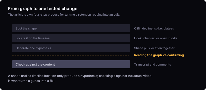
Turning a graph into an actual edit takes four steps, in order:
- Spot the shape. Cliff, gradual decline, spike or plateau. Do not skip this — the fix depends entirely on which one you're looking at.
- Locate it. Note the exact timestamp and whether it lines up with the hook, a chapter boundary, or the open middle of the video.
- Generate one hypothesis. Based on shape and location together, using the table above as a starting point, not a rulebook.
- Check it against the actual content. Watch that exact section again, read the transcript, and check comments near that timestamp for anything specific.
One hypothesis, tested once, on the next video, is worth more than a list of five guesses applied to none. If you're rebuilding the opening because the graph pointed at the first 30 seconds, writing the opening and the youtube hook formula: six archetypes and how to pick one cover the mechanics of a delivery-matching hook. If the retention picture looks fine but views still aren't coming in, that's a different problem, and why your youtube videos aren't getting views covers the packaging side separately.
The limit
The retention graph only shows when viewers stopped watching, not why. It cannot distinguish a boring section from a confusing one, an ad break from a genuine drop-off, or a viewer's personal interruption from a real content failure. Any cause you assign to a shape is a hypothesis to test against the video itself, never a fact the graph has already proven. Treat every diagnosis in this article as a starting point for that check, not the end of it.
If you want a second pass on a specific video, the video teardown walks the retention curve alongside the script and thumbnail together, and the metric glossary has the exact definitions if a term here didn't match what you're seeing in your own analytics.